Craft a Compelling Value Proposition

In last week’s article, I discussed how and why a business should design a blueprint for their online marketing success. This week I’ll continue to build upon that foundation by uncovering the most critical element to your ability to convert website visitors to customers: the clarity in which you communicate your value proposition or your unique selling proposition.
Whatever you call it, it comes down to the reason why someone should do business with you, as opposed to the alternative. That alternative could be a competitor or the decision to take no action at all. But it is up to your online marketing strategy to craft a compelling value proposition that will drive your ideal prospect to purchase from you.
Your value proposition must be brief. The Internet is the world of the nano-second attention span. If your website visitor does not find what they’re looking for in 7 seconds or less, they are highly likely to click the “back” button and abandon your website. It is vital that within 7 seconds your website clearly answers the following three questions for your website visitor:
• Where am I?
• What can I do here?
• Why should I do it here?
Your value proposition much be supported by evidentials throughout your website or online experience. It can be supported by awards or testimonials, but it must outline a quantifiable benefit or value that a customer will experience as a result of doing business with you. Everything on your website needs to support your value positions, from design elements to paragraph headers to blog articles and videos.
Have a Persuasive Call-to-Action Message
It is important site visitors know what you want them to do upon coming to your website or landing on your landing page. Your value proposition will persuade or compel them to take action, but your call-to-action will make it clear the next desired step you want your visitor to take.
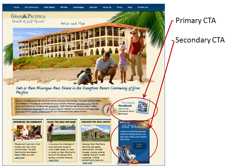
In some cases your website may have a primary and secondary call-to-action. If the site visitor is not yet ready to take the primary action (due to their current stage of their buying cycle or unique role or persona), they should be given a second option. Below is an example of a secondary and primary call-to-action. Gran Pacifica knows that their ideal prospect is likely to download the handbook as the next logical step in their sales/lead-nurturing sequence, however the website also allows visitors that are ready to move forward in their purchasing decision to go straight to registration in order to “Come and Visit Over a Chill Weekend.”

When a call-to-action is not evident or easy to find, this leads to unsupervised thinking and confusion on the part of the website visitor. The positioning of your call-to-action on the web page is very important.
Most marketers think that the call-to-action should always be above the fold or higher on the page, keeping website visitors from having to scroll down to find what they are to do on the page. However, that’s not always the case.
What’s more important is to have the call-to-action within the natural eye-path and thought sequence of the site visitor and in the right order. For instance, you don’t want to ask the site visitor to take action (call-to-action) until they know why they should take action (value proposition). So, your entire conversion path must be tightly synchronized.
The call-to-action should also clearly communicate what step they are taking and what they should expect as a result of taking that action. For instance, the worst call-to-action that is commonly used is “Submit.” It is bland and communicates no value. Another bad call-to-action is “Click Here.”
The button or form should specifically communicate to the user what action they can take or the benefit of taking an action, such as “Apply Here to Save” or “Request to be Contacted” so that the value of that step is reinforced - because that value must outweigh any friction, anxiety, and/or cost of taking that action.
Despite applying these best practices, it’s still often difficult to know what call to action will perform the best. So, it’s important that you implement A/B split testing that will allow you to split the traffic between two versions of the landing page so that you can test variant call-to-actions, or any other elements on the page (i.e. images, layout, paragraph headers, headlines, etc.).
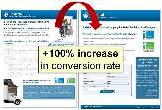
Below is an example of two landing page treatments that were tested. As a result of A/B split-testing, the landing page could be optimized for performance, and the conversion rate doubled.

Next week, in Part III of this article, I'll discuss another component of building a blue print for success: conducting an online competitive analysis.


