Xcellimark Helps Schakolad Chocolate Factory Increase the Click-Through Rate to Their Shopping Car

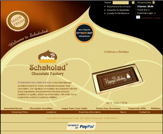
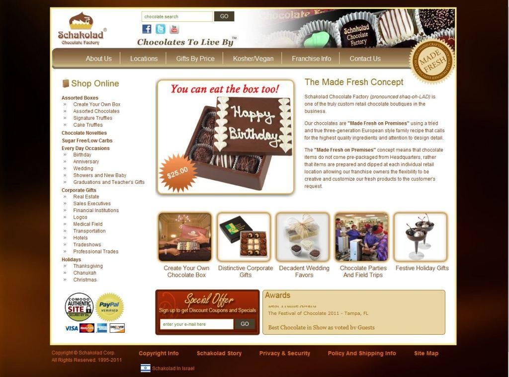
After attending a seminar put on by Xcellimark on the importance of getting better conversion rates on your website as opposed to always concentrating on gaining more traffic and visitors, Schakolad Chocolate Factory asked Xcellimark to consult with them on how to redesign their home page to encourage more online sales.
Schalolad makes delicious, award-winning European-style chocolates in many different styles and designs. From its humble beginnings with one store in South Florida, Schakolad now has 27 stores in the U.S. and 1 internationally. You can go by any of their local franchises and pick up fresh chocolate for yourself or for gifts.
But, many people didn’t realize until recently that you could also shop online at http://www.schakolad.com/ and order the same fresh chocolate, shipped directly to your home or office.
Work On Conversions & Eye Path First Before Concentrating on More Visitors
In studying the layout and design of the home page, Xcellimark realized that it was not clear that visitors could order chocolates online. In fact, when you landed on the home page, it wasn’t immediately clear where you were and what you could do on the website.
So Xcellimark worked with Schakolad to help them clearly articulate their value proposition of why visitors should buy from them. In addition, we identified areas of friction, anxiety and confusion that were occurring on the home page that could cause visitors to leave the site without engaging in online shopping. And we helped identify ways to make it very clear to a visitor that this was an e-commerce site and you could easily order chocolates online.
Since this was simply a consulting engagement, Xcellimark did not actually do the design and reprogramming of the home page. Instead, we analyzed what was working and not working on the home page and then made recommendations for the design wireframe, layout and content changes to help improve the click through rate to their online shopping cart, increase the sales conversion rate, and encourage more email signups for visitors to receive specials and coupons.
 Great Results Within the First Month and it Keeps Getting Better
In less than 2 months after the redesign was implemented on their home page the click through rate to Schakolad’s shopping cart increased 158%. In addition, they increased their online chocolate sales per visitor by 57% over the same month last year. Their email signups increased significantly as well, allowing them to have a much larger group of interested buyers receive ongoing marketing emails.
Increasing website traffic is the next goal that will be tackled by Schakolad. Now that the percent of online conversions has increased, getting more visitors to the website will help expand their overall sales. Just in time for people to order their chocolate for the holidays!
Contact Xcellimark to find out how you can improve your online conversion rates as well. We look forward to working with you.


